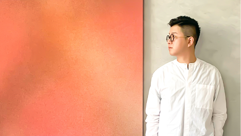
WESLEY LIU is the award-winning creative director of design firm PplusP. Here, he chats about his background and design approach, and runs us through three recent interior design projects.
Tell us about PplusP in a nutshell.
We are a small but highly efficient team working on projects of every scale. While we deal with a diverse range of projects, including offices, boutique hotels and retail brands, residential properties usually account for more than 50 percent of our projects.
We’ve been recognised for our “eco focus”, I think because we always persuade our clients not to waste – not to waste energy, not to waste nice materials that are still in good condition, not to waste the natural weathering they might find on buildings or objects. These ideas can be observed in many of our past projects.
Do you have an overall design philosophy?
My design philosophy is “no philosophy”! I hate to talk about “style” and “trends”. These are defined by the media and other groups of people; they’re not bespoke. I believe in “form follows function”; so, prior to considering the aesthetic side of a project, I like to solve any functional issues that might exist.
You’ve spent a lot of time in Japan and Australia in the past; has that influenced your design approach?
My early childhood experience in Japan taught me about the detail in form and function, humility in design, and the level of service I should provide to clients. The experiences in Australia allowed me to gain a very broad vision of different cultures, as I made friends from around the globe while living there.
Have you observed any changes in client requests on account of the pandemic?
Only that people seem more cautious around hygiene issues. Many request a designated spot for cleaning products in their home, or they add disinfecting gadgets; others are interested in our Japanese bathroom concepts where we promote “dry” and “wet” separation. Clients seem pickier about kitchen counter-tops, too, often requesting advanced antimicrobial materials.
What are some new or upcoming projects for 2021?
We’re working on a few more houses of clients who are also art collectors; we’re looking forward to seeing their collections in place with our design concepts. Other upcoming collaborations include a penthouse project with a designer from Poland, and a flooring company showroom with two other Hong Kong designers. Our commercial projects for 2021 range from a kids’ learning playground to small chain-store counters
Where in Hong Kong do you live, and what’s the design aesthetic of your own home?
I live in the Mei Foo Sun Chuen estate where I grew up – it’s more than 50 years old. I love this old-style estate where everything you need is only few steps away: markets, entertainment centres, sport facilities, parks – and a lot of greenery.
My home has a bare ceiling and an open kitchen, with an oversized “island” connected to a custom-made dining table. This is the most important place in my home; it’s where I spend most of my time, cooking and working. I have antique light switches, plus an antique sewing machine as the support for the dining table; this is an example of the sense of humour I love to incorporate into my design. We should always add some fun into life, to make it beautiful!
3 PplusP Projects
Project: Strength in Gentleness
Theme: East Meet West
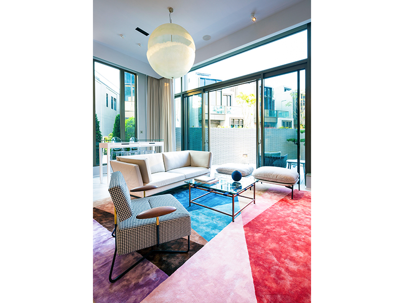
“As a Chinese art lover who grew up in the US and is now back in Asia, the client wanted her home to serve as a reminder of her life’s journey. So, we fashioned the lower floor with Western paintings and sculptures, leaving the upper floor for Chinese art. That way, when you tour the house, you experience a cultural shift. She also wanted the home to reflect her personality: tough on the outside but soft on the inside. So we incorporated a bold use of red throughout, offset by muted colours and wooden accents.”
Project: The Ko’s
Theme: Simple Luxury
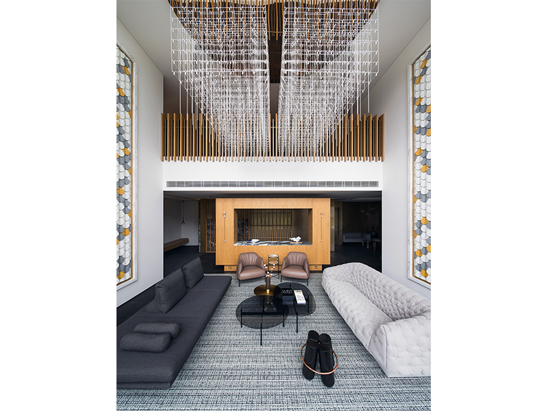
Three generations of one family have lived in this 1,000-square-metre house on a privately owned hill in the New Territories. The design brief was a complete renovation of both exterior and interior. While the structure was kept intact, the facades were given a new “skin” with Equistone fibre cement boards. Inside, the design balances aesthetics and function; it exudes luxury, simplicity and elegance with a touch of a modern oriental element. The result is totally refreshed outlook.
Project: R250
Theme: Baby-friendly
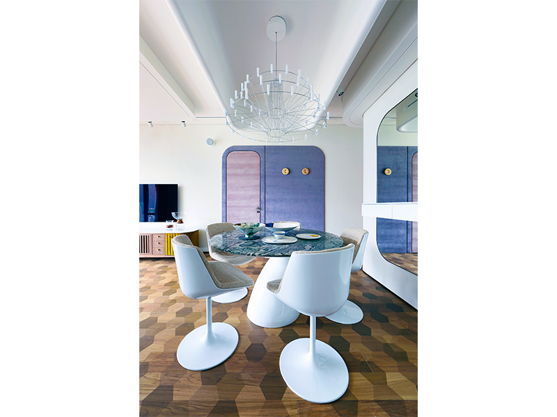
This 1500-square-feet apartment was designed for a young couple who wanted an environment for their baby to crawl around freely. So, all the furniture details and wall corners were filleted or upholstered with soft pads. The treatment of everything from the ceiling features to the furniture was done in a homogeneous way, resulting in a comfortable, unifying style, and a harmonious atmosphere. This project breaks through the perception of a baby-friendly home as being one that’s full of cute objects.
Find out more about the design firm’s projects and get in touch with them at ppluspdesigners.com.
Subscribe to Expat Living magazine now so you never miss an issue.

